
OakNorth Bank
Brand-led redesign

OakNorth is one of the UK's leading digital banks — built by entrepreneurs, for entrepreneurs. The existing website fell short of both the bank's market positioning and its brand standards. The brief called for a full redesign — rebuilding the visual language and interface from the ground up to reflect that identity.
Client
OakNorth Bank
Role
UI Lead
Interaction DesignArt Direction
A homepage that speaks entrepreneur to entrepreneur
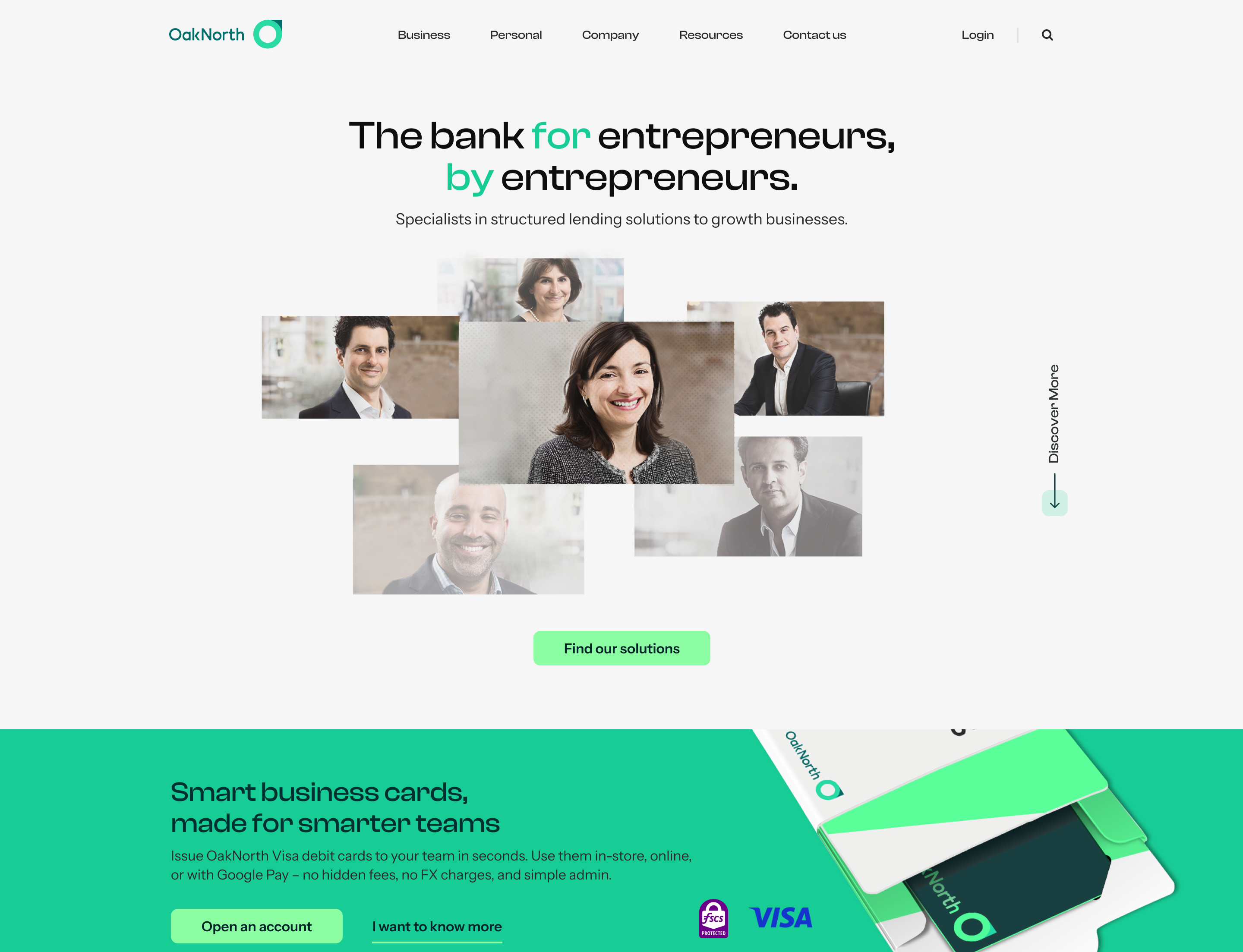
The homepage is structured to build trust progressively. The hero leads with OakNorth's core identity — a bank built by entrepreneurs, for entrepreneurs — immediately followed by the Smart Business Card, the product that makes that promise tangible.
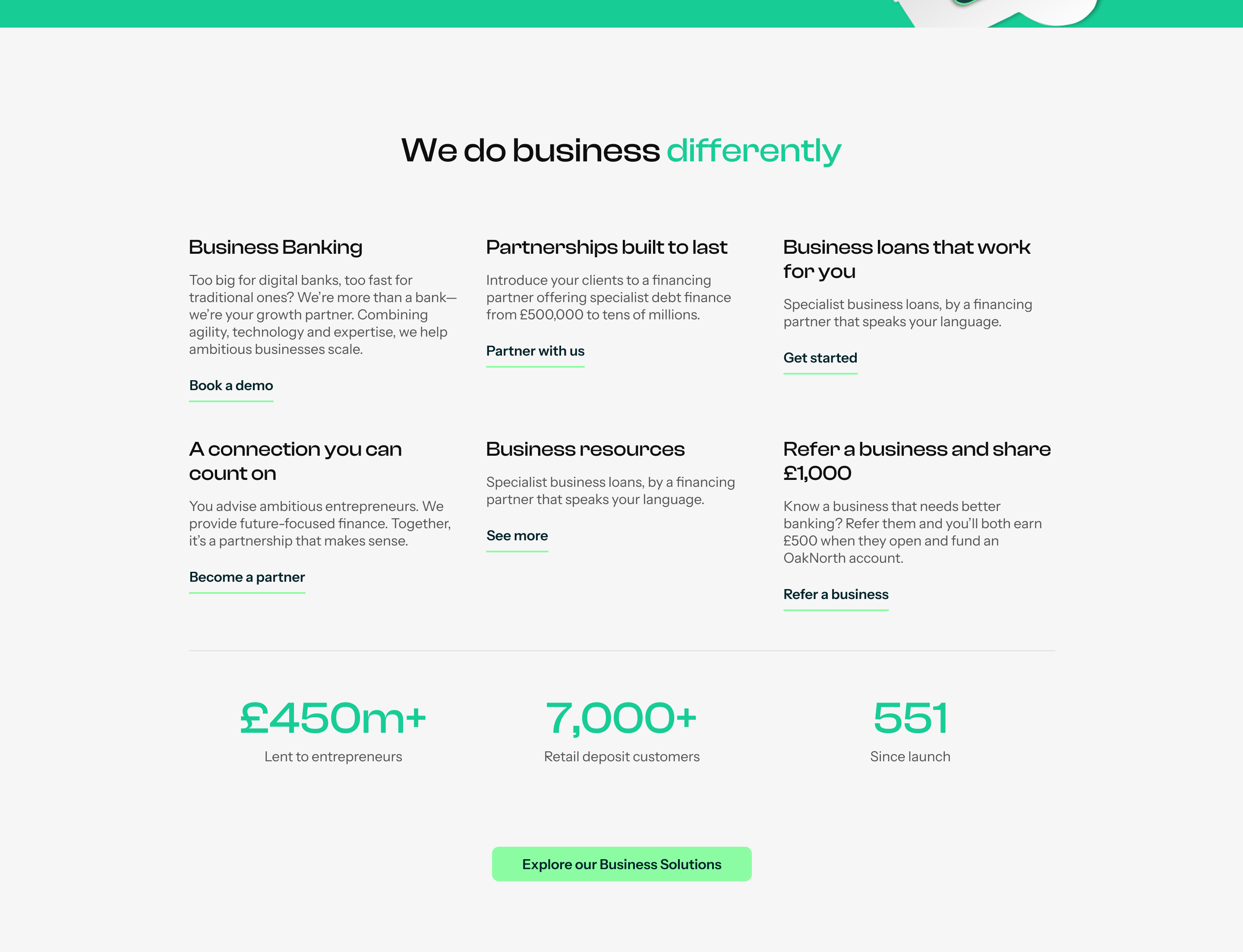
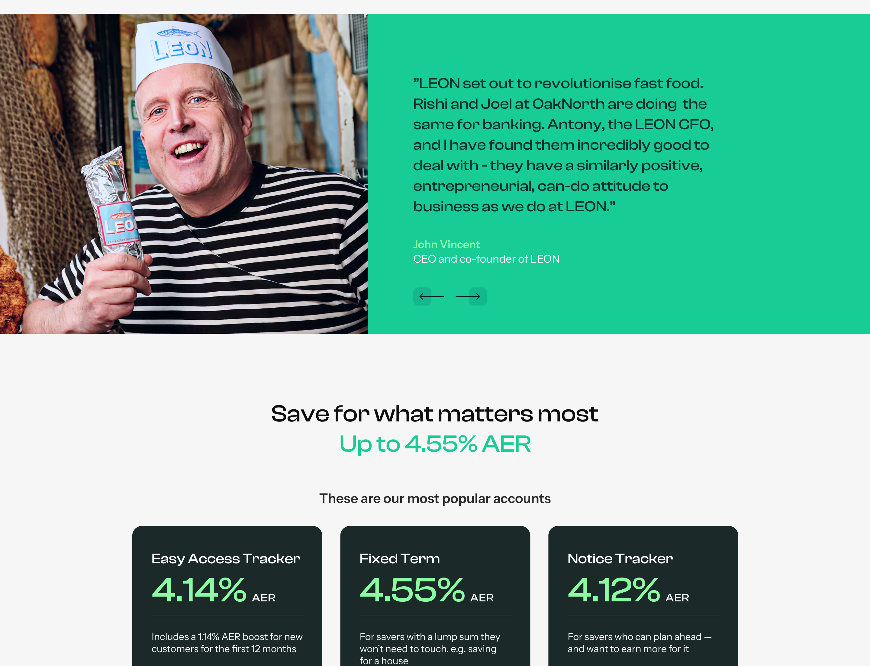
'We do business differently' anchors the brand's key differentiators with hard numbers: total deposits, businesses launched, and pounds lent to entrepreneurs — turning positioning into proof. Client testimonials follow, adding a human layer to the numbers.
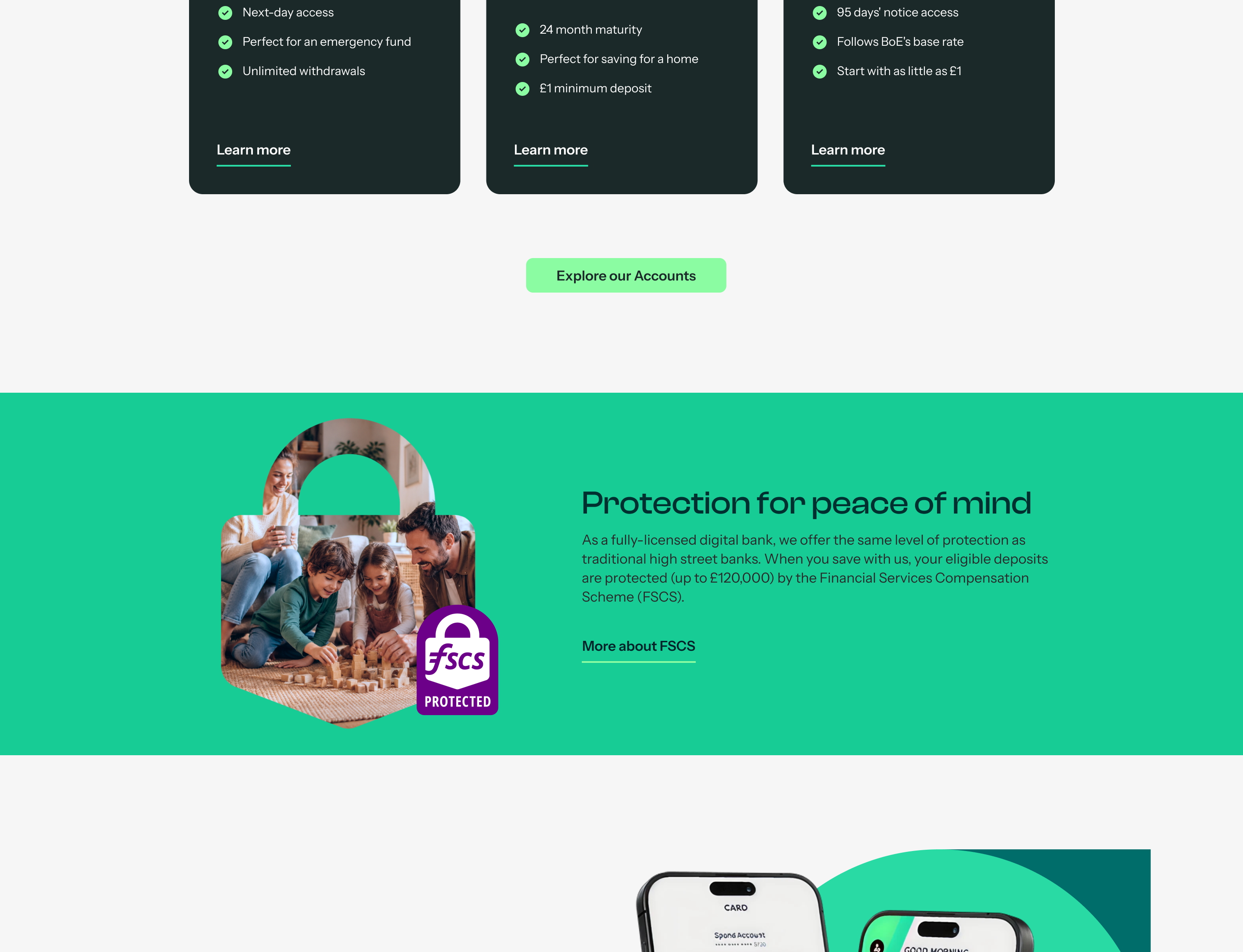
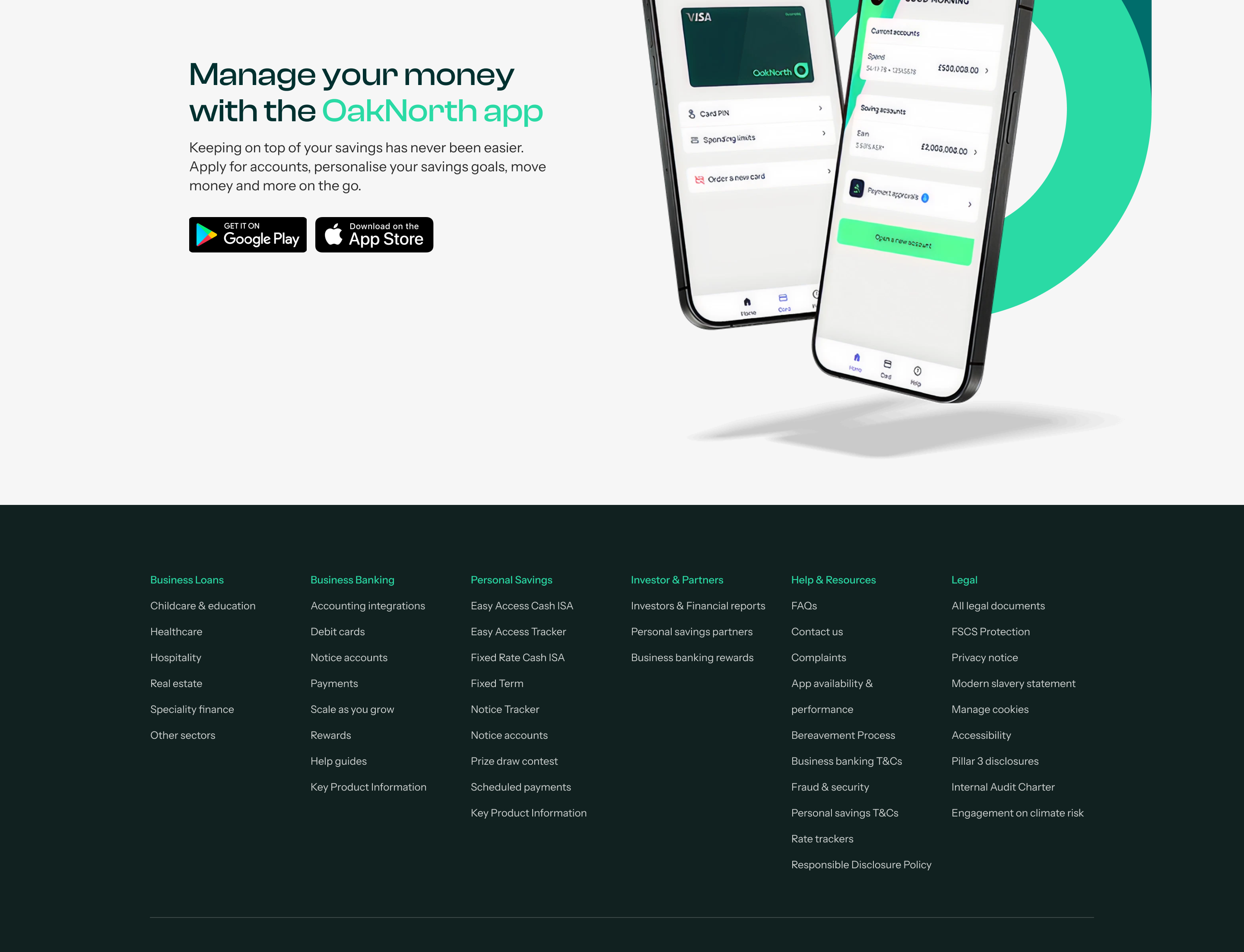
The three main accounts are presented with their headline rate — up to 4.55% AER — making the commercial offer unambiguous, while the FSCS badge reinforces that this ambition comes with the credibility of a fully licensed bank. The page closes with a promotion of the mobile app, extending the relationship beyond the desktop.

Bringing real entrepreneurs into the brand
An early exploration of the hero's interaction model — layered images of real entrepreneurs (OakNorth's own customers) revealing themselves as the visitor scrolls, reinforcing the 'by entrepreneurs, for entrepreneurs' positioning from the very first frame.
Making the case for why OakNorth is different
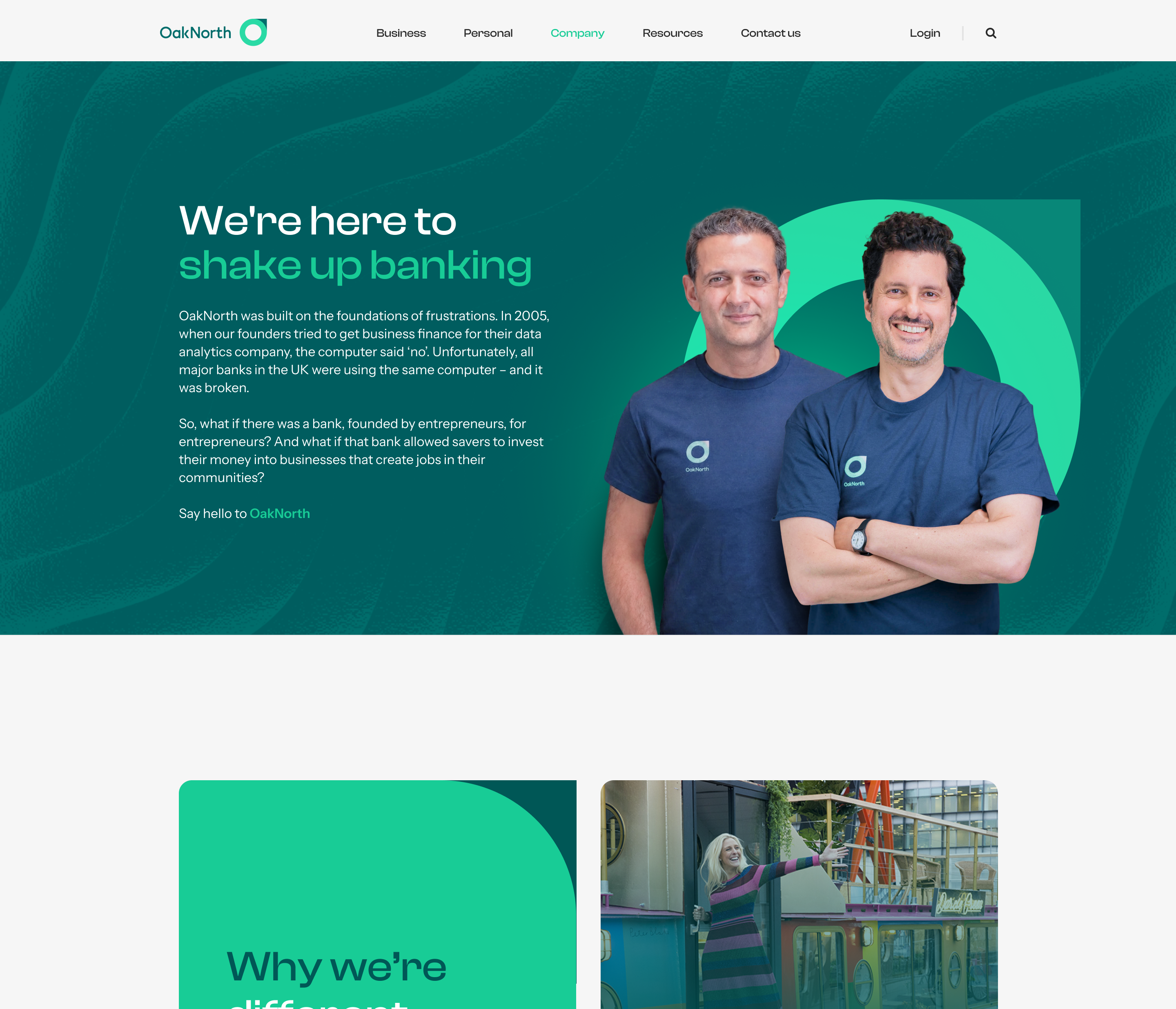
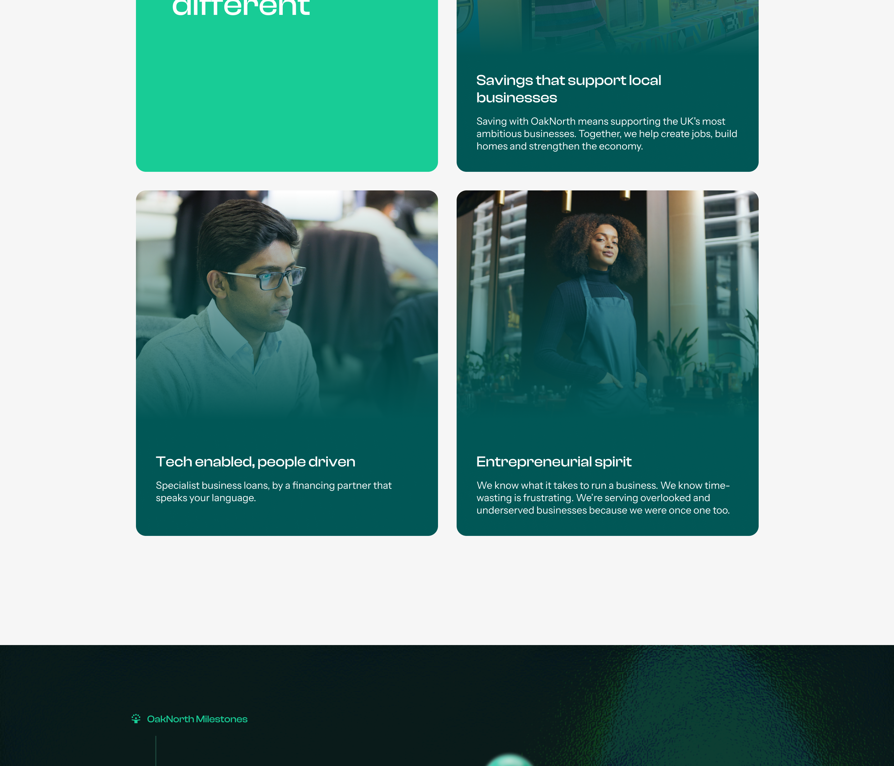
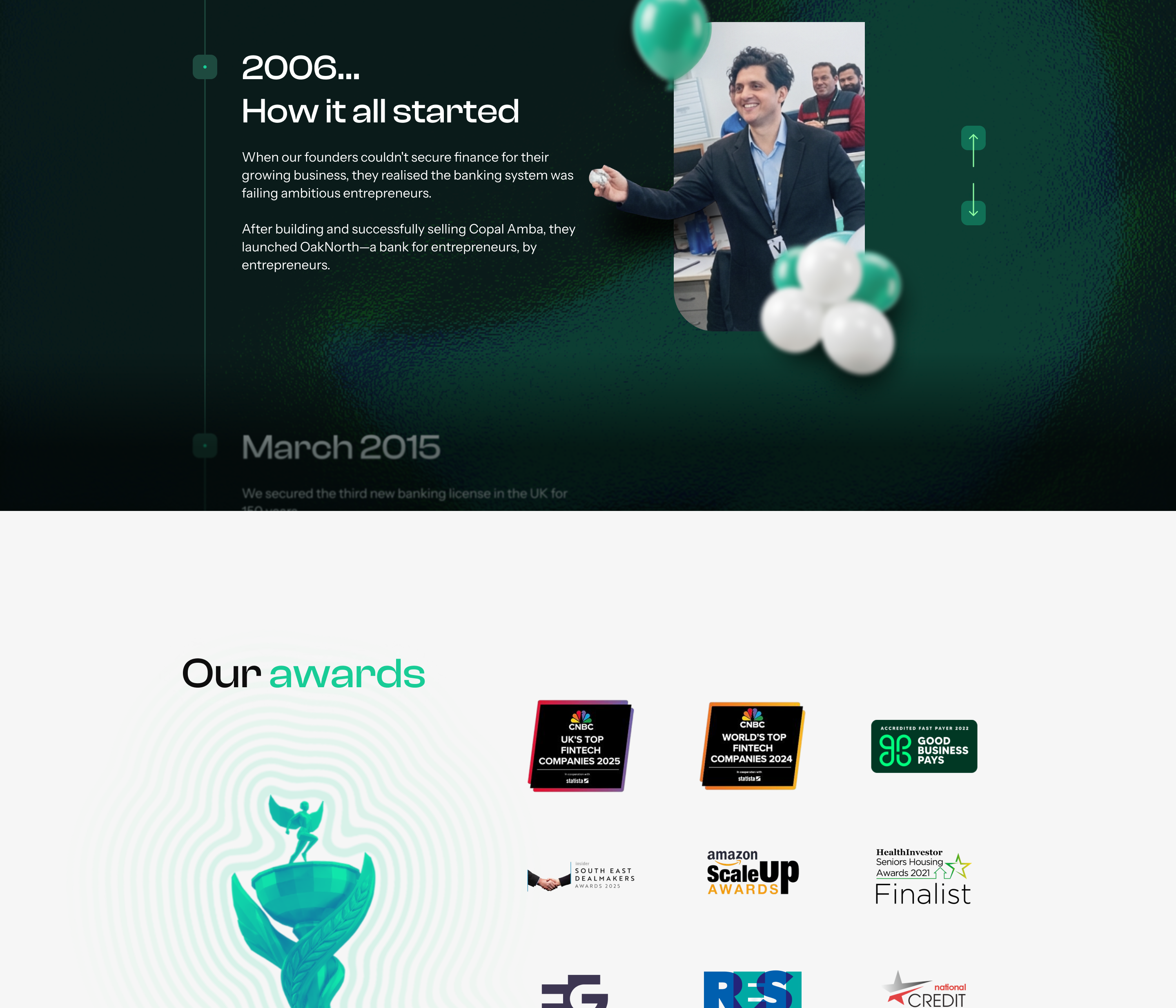
The Company page builds the institutional case behind the product. It opens with the founders — grounding the 'entrepreneurs for entrepreneurs' promise in real people — before laying out why OakNorth is different, and the milestones that back that claim.
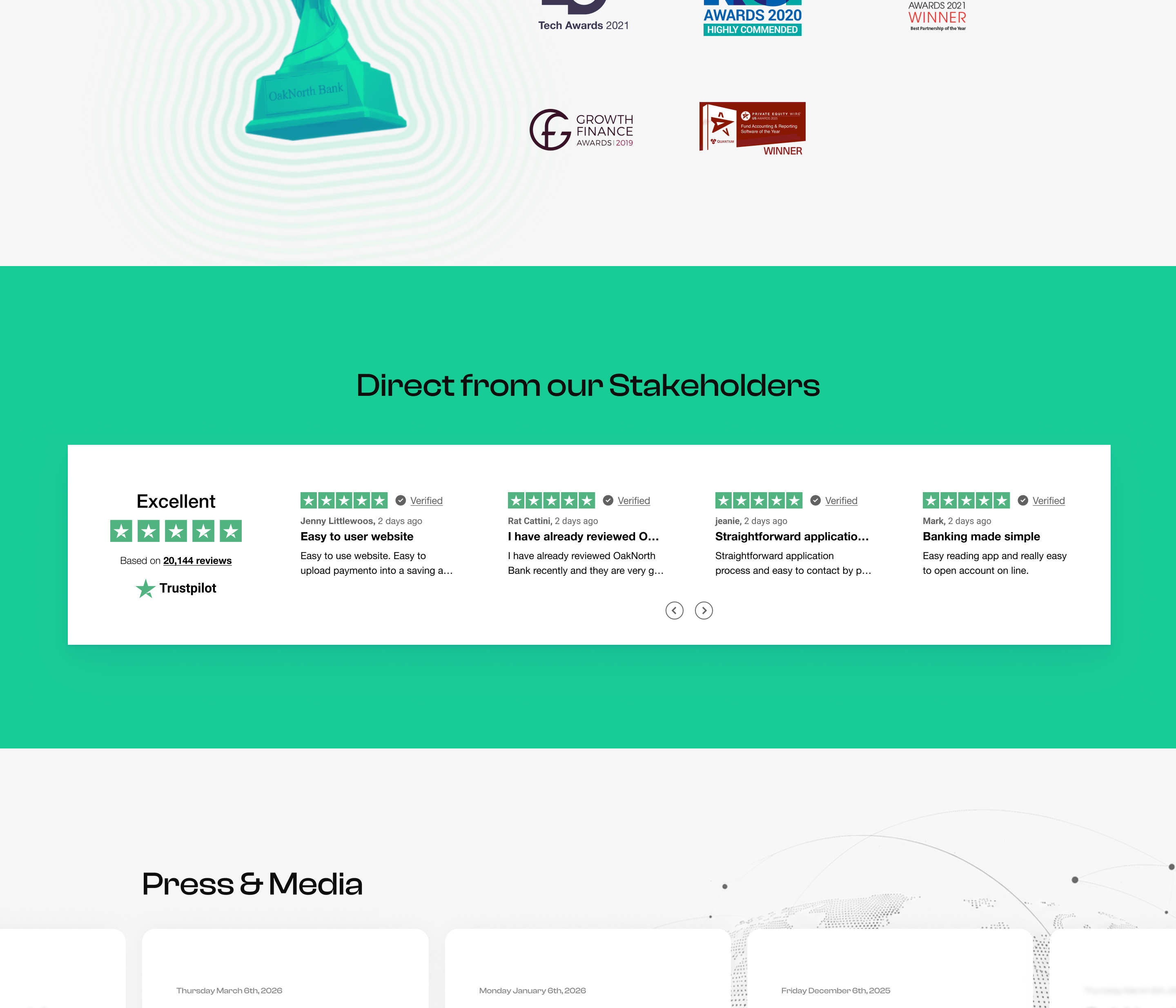
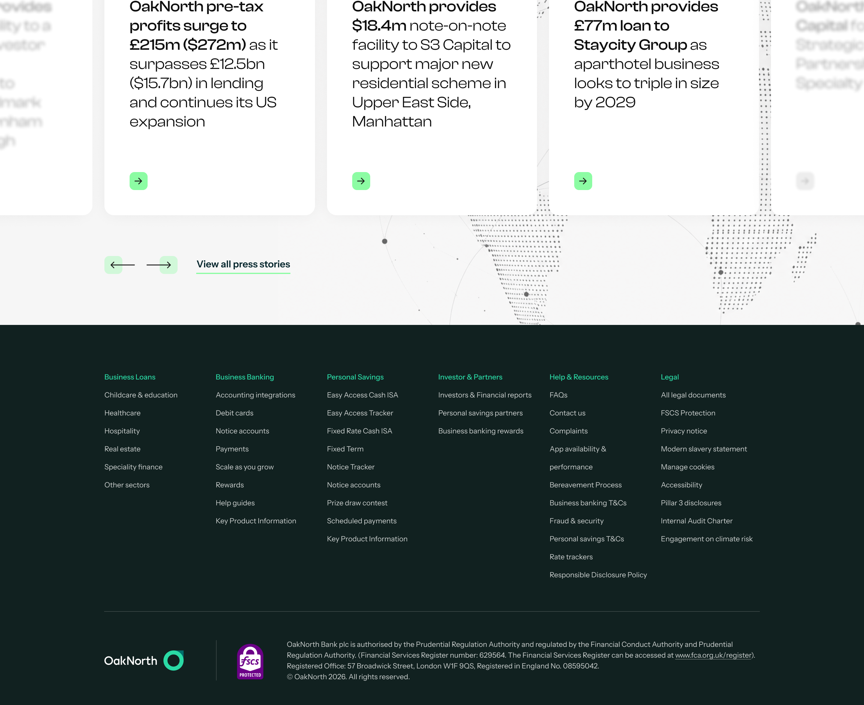
Awards and a live Trustpilot feed add independent validation, while a dedicated press and media section signals that OakNorth is a bank taken seriously beyond its own marketing — completing the trust-building arc started on the homepage.


Get in touch
hi@pedroportugal.com


© 2026 Pedro Portugal
User Interface
Design Systems
Digital Products
OakNorth Bank
Brand-led redesign
OakNorth is one of the UK's leading digital banks — built by entrepreneurs, for entrepreneurs. The existing website fell short of both the bank's market positioning and its brand standards. The brief called for a full redesign — rebuilding the visual language and interface from the ground up to reflect that identity.
Client
OakNorth Bank
Role
UI Lead
Interaction DesignArt Direction
A homepage that speaks entrepreneur to entrepreneur
The homepage is structured to build trust progressively. The hero leads with OakNorth's core identity — a bank built by entrepreneurs, for entrepreneurs — immediately followed by the Smart Business Card, the product that makes that promise tangible.
'We do business differently' anchors the brand's key differentiators with hard numbers: total deposits, businesses launched, and pounds lent to entrepreneurs — turning positioning into proof. Client testimonials follow, adding a human layer to the numbers.
The three main accounts are presented with their headline rate — up to 4.55% AER — making the commercial offer unambiguous, while the FSCS badge reinforces that this ambition comes with the credibility of a fully licensed bank. The page closes with a promotion of the mobile app, extending the relationship beyond the desktop.
Bringing real entrepreneurs into the brand
An early exploration of the hero's interaction model — layered images of real entrepreneurs (OakNorth's own customers) revealing themselves as the visitor scrolls, reinforcing the 'by entrepreneurs, for entrepreneurs' positioning from the very first frame.
Making the case for why OakNorth is different
The Company page builds the institutional case behind the product. It opens with the founders — grounding the 'entrepreneurs for entrepreneurs' promise in real people — before laying out why OakNorth is different, and the milestones that back that claim.
Awards and a live Trustpilot feed add independent validation, while a dedicated press and media section signals that OakNorth is a bank taken seriously beyond its own marketing — completing the trust-building arc started on the homepage.
Get in touch
hi@pedroportugal.com
© 2026 Pedro Portugal
User Interface
Design Systems
Digital Products
OakNorth Bank
Brand-led redesign

OakNorth is one of the UK's leading digital banks — built by entrepreneurs, for entrepreneurs. The existing website fell short of both the bank's market positioning and its brand standards. The brief called for a full redesign — rebuilding the visual language and interface from the ground up to reflect that identity.
Client
OakNorth Bank
Role
UI Lead
Interaction DesignArt Direction
A homepage that speaks entrepreneur to entrepreneur
The homepage is structured to build trust progressively. The hero leads with OakNorth's core identity — a bank built by entrepreneurs, for entrepreneurs — immediately followed by the Smart Business Card, the product that makes that promise tangible.
'We do business differently' anchors the brand's key differentiators with hard numbers: total deposits, businesses launched, and pounds lent to entrepreneurs — turning positioning into proof. Client testimonials follow, adding a human layer to the numbers.
The three main accounts are presented with their headline rate — up to 4.55% AER — making the commercial offer unambiguous, while the FSCS badge reinforces that this ambition comes with the credibility of a fully licensed bank. The page closes with a promotion of the mobile app, extending the relationship beyond the desktop.
Bringing real entrepreneurs into the brand
An early exploration of the hero's interaction model — layered images of real entrepreneurs (OakNorth's own customers) revealing themselves as the visitor scrolls, reinforcing the 'by entrepreneurs, for entrepreneurs' positioning from the very first frame.
Making the case for why OakNorth is different
The Company page builds the institutional case behind the product. It opens with the founders — grounding the 'entrepreneurs for entrepreneurs' promise in real people — before laying out why OakNorth is different, and the milestones that back that claim.
Awards and a live Trustpilot feed add independent validation, while a dedicated press and media section signals that OakNorth is a bank taken seriously beyond its own marketing — completing the trust-building arc started on the homepage.

© 2026 Pedro Portugal
User Interface
Design Systems
Digital Products
Privacy Policy
Get in touch
hi@pedroportugal.com


