
Yumans
Digital brand identity
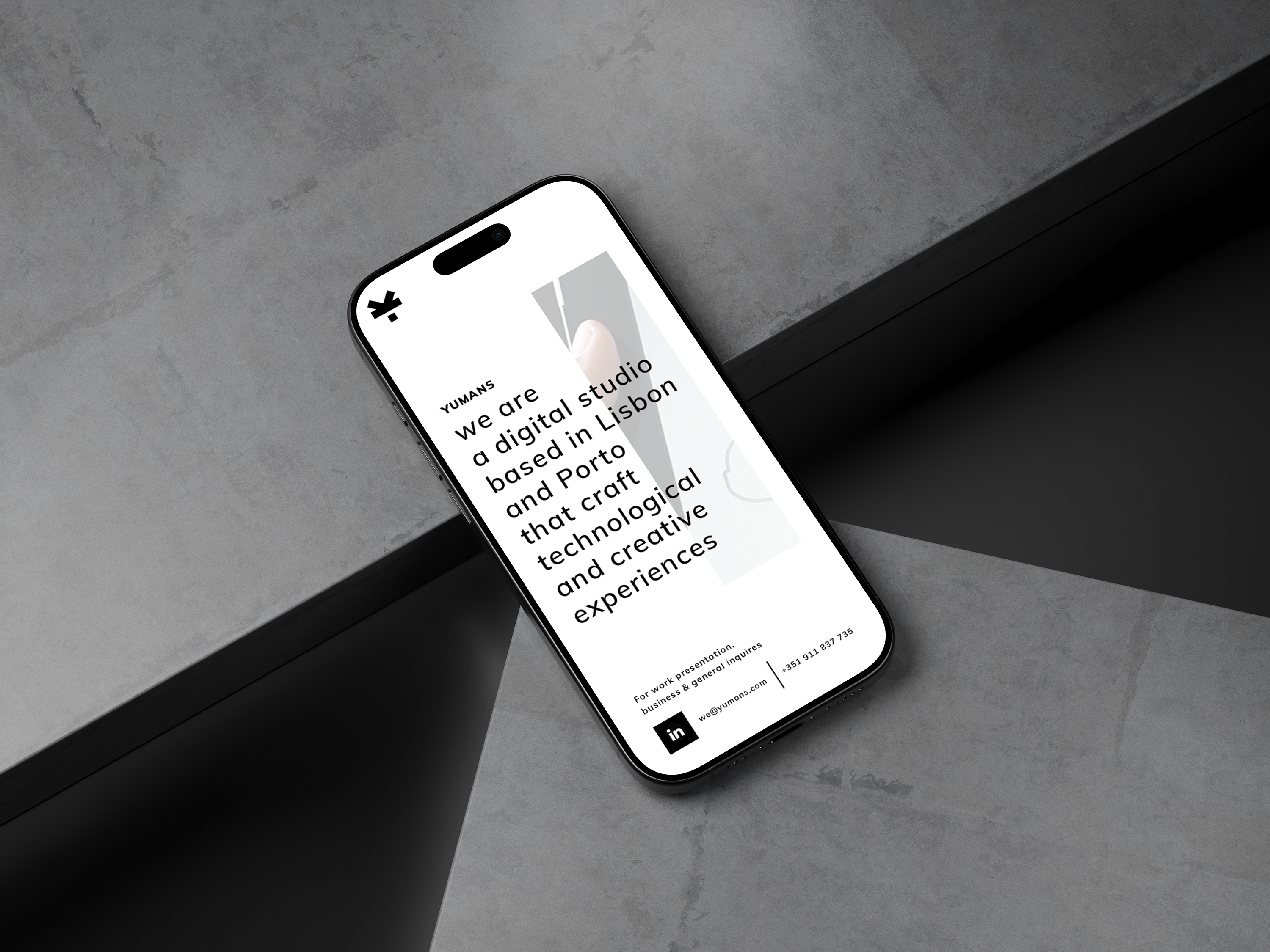
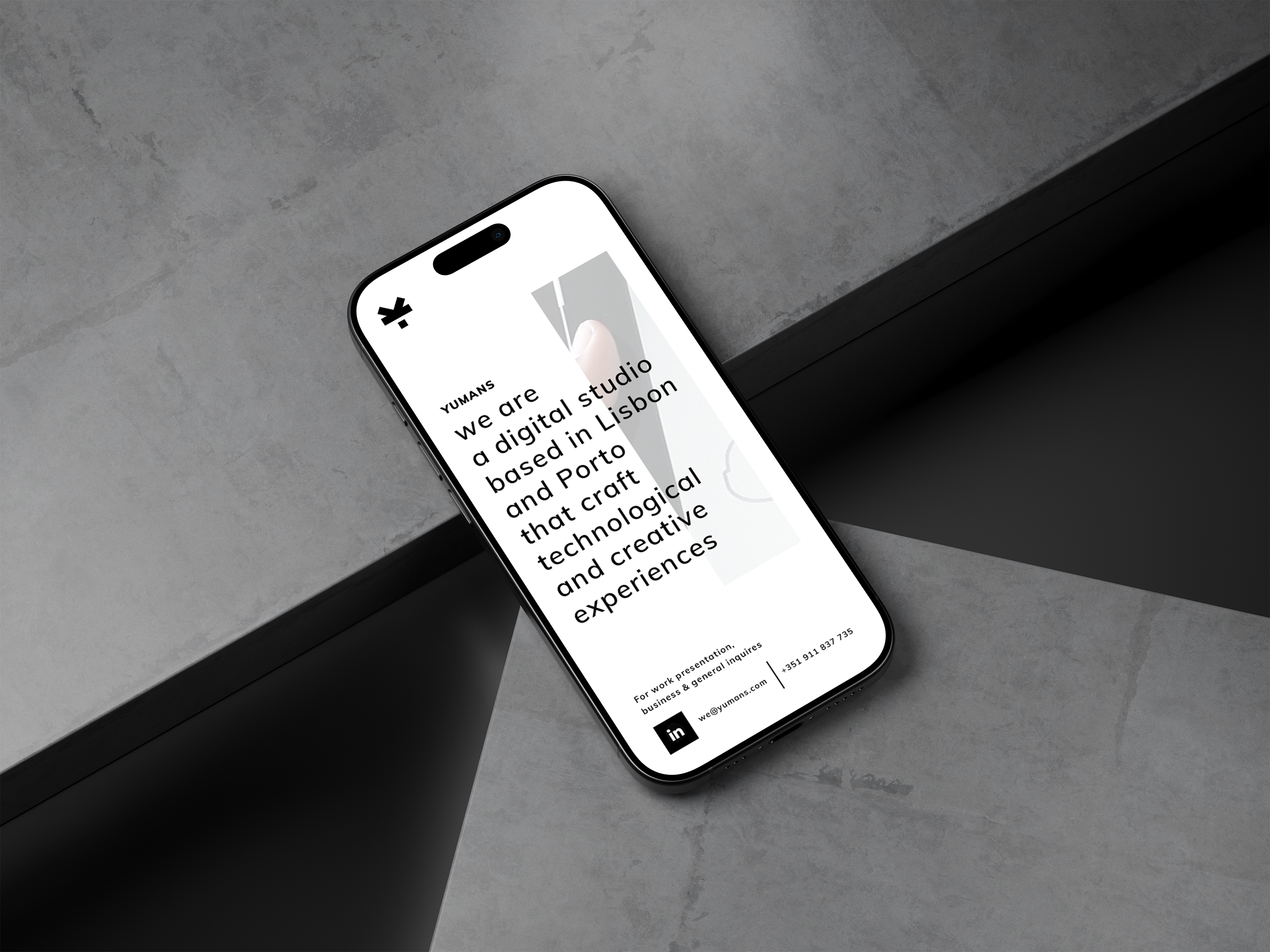
Yumans is a digital studio built around simplicity, honesty, and high-quality craft. The brand identity was conceived and executed from the ground up — from naming and logo to illustration system, typography, and web presence. Minimalism was the design foundation throughout.
Client
Yumans
Role
Art Direction
Brand Design
Front-end developer
Fábio Azevedo
Finding the mark: a Y that becomes a human figure
Early exploration focused on simplicity above all. The identity converged early on a single concept — a mark that reads as the letter Y while also resembling an inverted human figure, present from the very first sketches. What followed was refinement, not reinvention: deciding how elegant, thin, or bold the final mark should feel. We settled on the boldest version.



One figure, endless expression
The same mark — the inverted human figure — became a flexible avatar used throughout the brand's communication, adaptable enough to illustrate a wide range of actions and moments while always staying recognisably Yumans.




Two colours, endless meaning
The illustration system pushes the same restraint further: black and white only, with yellow reserved for moments that need an accent. The simpler the shape, the more it had to work — these samples show how much meaning a minimal form can carry.







From dark to light: a first impression with intent
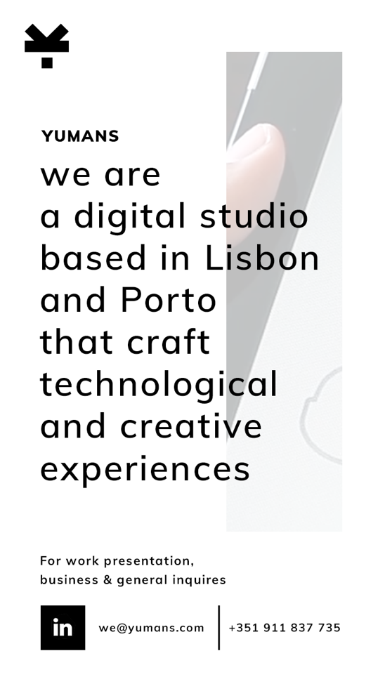
The website's opening moment sets the tone for a first-time visitor: a short, cinematic intro that builds the logo quickly, then transitions from a dark environment into light — reflecting the studio's ambition to feel innovative and premium, yet simple and direct.
The same intro, adapted for mobile.
The mark in motion
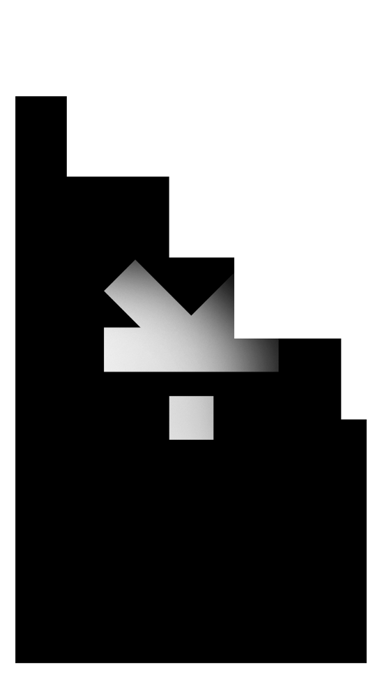
A short motion study exploring how the logo behaves in presentations and video material — proving the mark works as well in motion as it does static.
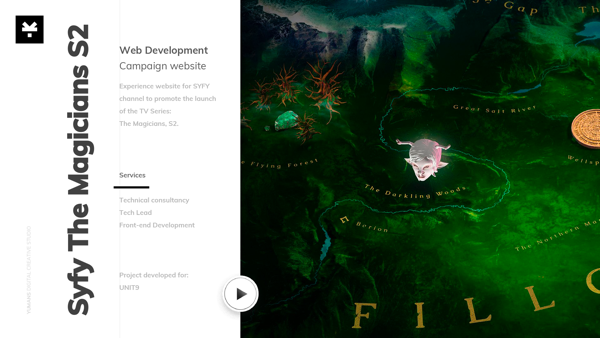
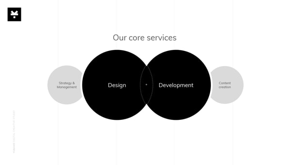
A presentation system, not just a deck
The identity extended into a full presentation template — covers, section breaks, and closing slides — so that any deck built on the brand would feel considered, not improvised.


Get in touch
hi@pedroportugal.com


© 2026 Pedro Portugal
User Interface
Design Systems
Digital Products
Yumans
Digital brand identity
Yumans is a digital studio built around simplicity, honesty, and high-quality craft. The brand identity was conceived and executed from the ground up — from naming and logo to illustration system, typography, and web presence. Minimalism was the design foundation throughout.
Client
Yumans
Role
Art Direction
Brand Design
Front-end developer
Fábio Azevedo
Finding the mark: a Y that becomes a human figure
Early exploration focused on simplicity above all. The identity converged early on a single concept — a mark that reads as the letter Y while also resembling an inverted human figure, present from the very first sketches. What followed was refinement, not reinvention: deciding how elegant, thin, or bold the final mark should feel. We settled on the boldest version.


One figure, endless expression
The same mark — the inverted human figure — became a flexible avatar used throughout the brand's communication, adaptable enough to illustrate a wide range of actions and moments while always staying recognisably Yumans.
Two colours, endless meaning
The illustration system pushes the same restraint further: black and white only, with yellow reserved for moments that need an accent. The simpler the shape, the more it had to work — these samples show how much meaning a minimal form can carry.







From dark to light: a first impression with intent
The website's opening moment sets the tone for a first-time visitor: a short, cinematic intro that builds the logo quickly, then transitions from a dark environment into light — reflecting the studio's ambition to feel innovative and premium, yet simple and direct.
The same intro, adapted for mobile.
The mark in motion
A short motion study exploring how the logo behaves in presentations and video material — proving the mark works as well in motion as it does static.
A presentation system, not just a deck
The identity extended into a full presentation template — covers, section breaks, and closing slides — so that any deck built on the brand would feel considered, not improvised.

Get in touch
hi@pedroportugal.com
© 2026 Pedro Portugal
User Interface
Design Systems
Digital Products
Yumans
Digital brand identity
Yumans is a digital studio built around simplicity, honesty, and high-quality craft. The brand identity was conceived and executed from the ground up — from naming and logo to illustration system, typography, and web presence. Minimalism was the design foundation throughout.
Client
Yumans
Role
Art Direction
Brand Design
Front-end developer
Fábio Azevedo
Finding the mark: a Y that becomes a human figure
Early exploration focused on simplicity above all. The identity converged early on a single concept — a mark that reads as the letter Y while also resembling an inverted human figure, present from the very first sketches. What followed was refinement, not reinvention: deciding how elegant, thin, or bold the final mark should feel. We settled on the boldest version.





One figure, endless expression
The same mark — the inverted human figure — became a flexible avatar used throughout the brand's communication, adaptable enough to illustrate a wide range of actions and moments while always staying recognisably Yumans.
Two colours, endless meaning
The illustration system pushes the same restraint further: black and white only, with yellow reserved for moments that need an accent. The simpler the shape, the more it had to work — these samples show how much meaning a minimal form can carry.
From dark to light: a first impression with intent
The website's opening moment sets the tone for a first-time visitor: a short, cinematic intro that builds the logo quickly, then transitions from a dark environment into light — reflecting the studio's ambition to feel innovative and premium, yet simple and direct.
The same intro, adapted for mobile.
The mark in motion
A short motion study exploring how the logo behaves in presentations and video material — proving the mark works as well in motion as it does static.
A presentation system, not just a deck
The identity extended into a full presentation template — covers, section breaks, and closing slides — so that any deck built on the brand would feel considered, not improvised.

© 2026 Pedro Portugal
User Interface
Design Systems
Digital Products
Privacy Policy
Get in touch
hi@pedroportugal.com


